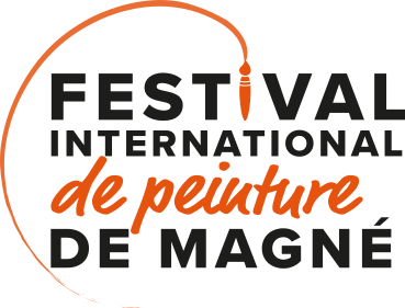
A new logo for the Festival
- Magné International Painting Festival
- 4 April 2023
- 14h58
- 0 comments
Discover the new logo of the Magné International Painting Festival
The Festival has just been given a new logo. You'll now be able to find this new visual identity on our various communication media!
The best tool to symbolise painting is the paintbrush. And it's evident in this logo. The end of the brush draws a circle, signifying unity and the cycle of life. Time passes, teams of volunteers come and go, but the Festival remains.
This circle is closed on one side, it is anchored in the past. The International Painting Festival was born 35 years ago. But this same circle remains open to encourage movement and the future. The shape of the exhibition reflects the artist's palette. Its minimal state expresses elegance and refinement.
In terms of colours, the logo comes in a range of variations, so that it can be adapted to the different media on which it will be used. The colour orange is a reference to the 2022 Grand Prix, as it can be found in the work of Roger Fages. As tradition dictates, this colour will change each year, depending on the winning entry from the previous year.

As far as the typography is concerned, the text is in Proxima Nova. This is a simple, legible linear typeface. Without serifs, it brings a modern feel to the project. The scripte typeface is used on the words "de peinture", suggesting that the artist is signing his work in his own hand.
table.
We would like to sincerely thank Gaëlle Geay, graphic designer and illustratorfor the quality of its work and its unfailing commitment to this project.

